It all felt like a bit of a whirlwind for Mio.
In the National Hockey League, it typically takes more than a year for a new jersey to be designed, tweaked, finalized, manufactured, and ultimately unveiled to the public. To call the approval process “rigorous” would be an understatement.
The rules governing special warm-up jerseys are less strict. Even so, you’d be in tough to find one that came together in less time than the Vancouver Canucks’ Pride Night jersey.
You’d also be hard-pressed to find a better one.
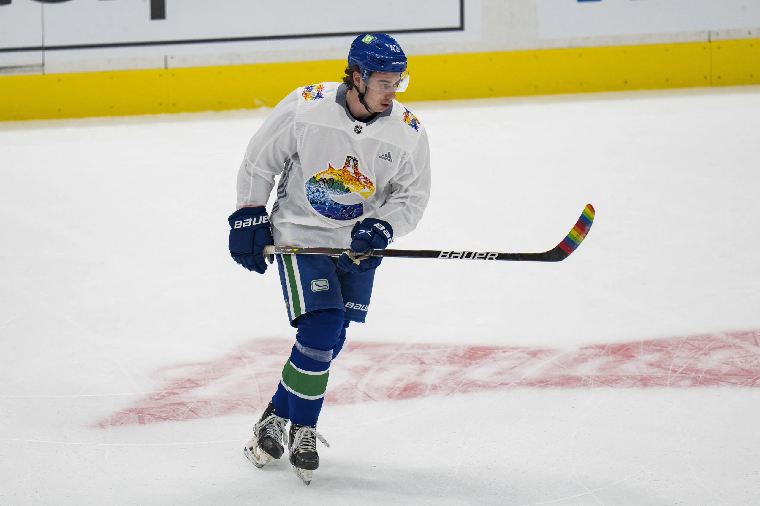
The Canucks’ Pride jersey — worn during warm-ups prior to Friday’s game against the Washington Capitals — came together in less than a month.
In early February, the Canucks
put out a call for an artist in the 2SLGBTQ+ community to help create the team’s 2022 Pride jersey. Mio immediately responded.
“It happened very quickly. The application form came out on the Thursday, they emailed me on Friday, and the meeting was on Monday,” Mio told CanucksArmy. “All of this was, like, done in only three weeks. It’s been pretty crazy.”
Mio is no stranger to creating hockey designs centred around her queer identity and love for the sport. Last summer, she
created an entire slate of “Pride Jerseys” for 31 NHL teams and later went on to
work with the Dallas Stars, Carolina Hurricanes, and the Premier Hockey Federation.
The Canucks’ Pride jersey marks the first time that Mio’s art has found its way onto a real-life uniform. She created the stylized, rainbow-coloured orca crest — which she nicknamed the
“Gay Orca,” or “Gorca” — and the intricate shoulder patch on
the jersey.
“After our initial meeting, I was tasked to come up with three sketches or concepts,” Mio said. “For those concepts, I began with doing research about the queer community in Vancouver, the environment around them, and symbols I could use.”
“It meant creating a Pinterest board and sketching a lot,” she added.
The final design the Canucks ultimately went with is called “Sea to Sky” and incorporates elements of the mountains, forest, ice, sky, and sea of British Columbia, all of which
connect to various aspects of Mio’s queer experience.
In addition to “Sea to Sky,” Mio said she also pursued another concept called “Break the Ice,” which she said related to the implied motion of the orca depicted in the Canucks’ logo and also connected to a “pretty potent queer metaphor.”
“Breaking the ice, coming out of the closet, breaking loose, shattering social norms — that was where my mind went first,” Mio explained. “Then I was also very keen on nature, flowers, space, water, skies, which is eventually what became the final Sea to Sky concept.
“Being queer is about being alive, right? It’s about, just, living and experiencing your life, and all of that. I really wanted to tap into that, too,” Mio added. “For me, a lot of my own experience and feelings are connected to nature.”
Mio’s most ambitious designs are rich in colour and detail, drawing upon sprawling ideas to create vast, vibrant worlds irrevocably and personally tied to hockey and the queer experience.
Her art mirrors her own individual connections to both those landscapes.
“I’m queer, that’s just a part of me, so that’s always going to be an element of my experience that I put into my art,” Mio said. “I love working with queer themes in my art, both abstractly and literally, but I think in general it is not as much of it being queer and more having a unique perspective, thoughts, and views, and how those go against what hockey is.
“I think that is part of what is uniquely me — how I see the world, and how I want to shape it and show it and tell stories how I experience them,” Mio added. “Being queer, that will always be a part of it in some way, even if it’s not the driving force.”
Growing up in Sweden, Mio has always had a connection to the hockey world. (“It’s Sweden, hockey has always been there,” she explained).
That relationship only strengthened after she joined Twitter in August 2020 and became more familiar with the National Hockey League and its teams.
“Hockey has always been a backdrop to growing up,” Mio said. “It wasn’t until through social media I discovered hockey could be for me and I was actually interested in it. So that meant my experience began with the NHL, and Swedish hockey came after.
“I am still getting into the Swedish hockey world, I am still new in that world, and I am still exploring it,” she continued. “A lot of it is focused on my university town, Luleå, and their women’s team, which is one of the best in Sweden. The connection I have formed with that through talking with people and meeting people in the city who like hockey — that’s my window into hockey here in Sweden, you know?”
In the days after the Canucks’ Pride jersey was unveiled, it was shared by
CTV Vancouver,
Global News, and
Outsports, earning
rave reviews for being a “truly gorgeous” design that “authentically represents the queer experience.”
“I’m surprised at the amount of, like, love it’s gotten? Like, I was completely stressed the day before it was released,” Mio said. “It was just tense. So, like, it was really nice knowing people got it.
“I wanted people to understand the story I wanted to tell and to be able to relate it to themselves, and be able to see where I was coming from and what I was telling with the design,” Mio continued. “I think the comments I’ve gotten about that hit me the most.”
Mio’s portfolio of art and professional work can be found
here. After donning their Pride jerseys, the Canucks went on to fall to the Capitals in overtime by a 4–3 final score.