


The man who designed the Vancouver Canucks’ original logo and jerseys prior to the 1970–71 season has called for the team to prioritize hockey over the “sweater business.”
West Vancouver resident Joseph Borovich, 83, sent a letter to Canucks owner and chairman Francesco Aquilini this week asking the team to stop cycling through different uniform designs.
“What are you selling – hockey or jerseys?” Borovich asked in his letter, which he also copied to the North Shore News, who were first to share the story. “Johnny Canuck didn’t help you last night against the expansion Las Vegas team when you blew a two-goal lead with 10 minutes left in the game. It didn’t help you against Boston, Toronto or Montreal either.
“What are you trying to establish here? All the different jerseys didn’t help when Bure was here or the Sedins. OK, they came close, but no cup. It’s only been 52 years, Mr. Aquilini.”
The Canucks donned Borovich’s “stick in rink” logo and the matching green and blue sweaters from 1970 to 1978 before abandoning the look entirely in favour of the ill-fated “Flying V” concept.
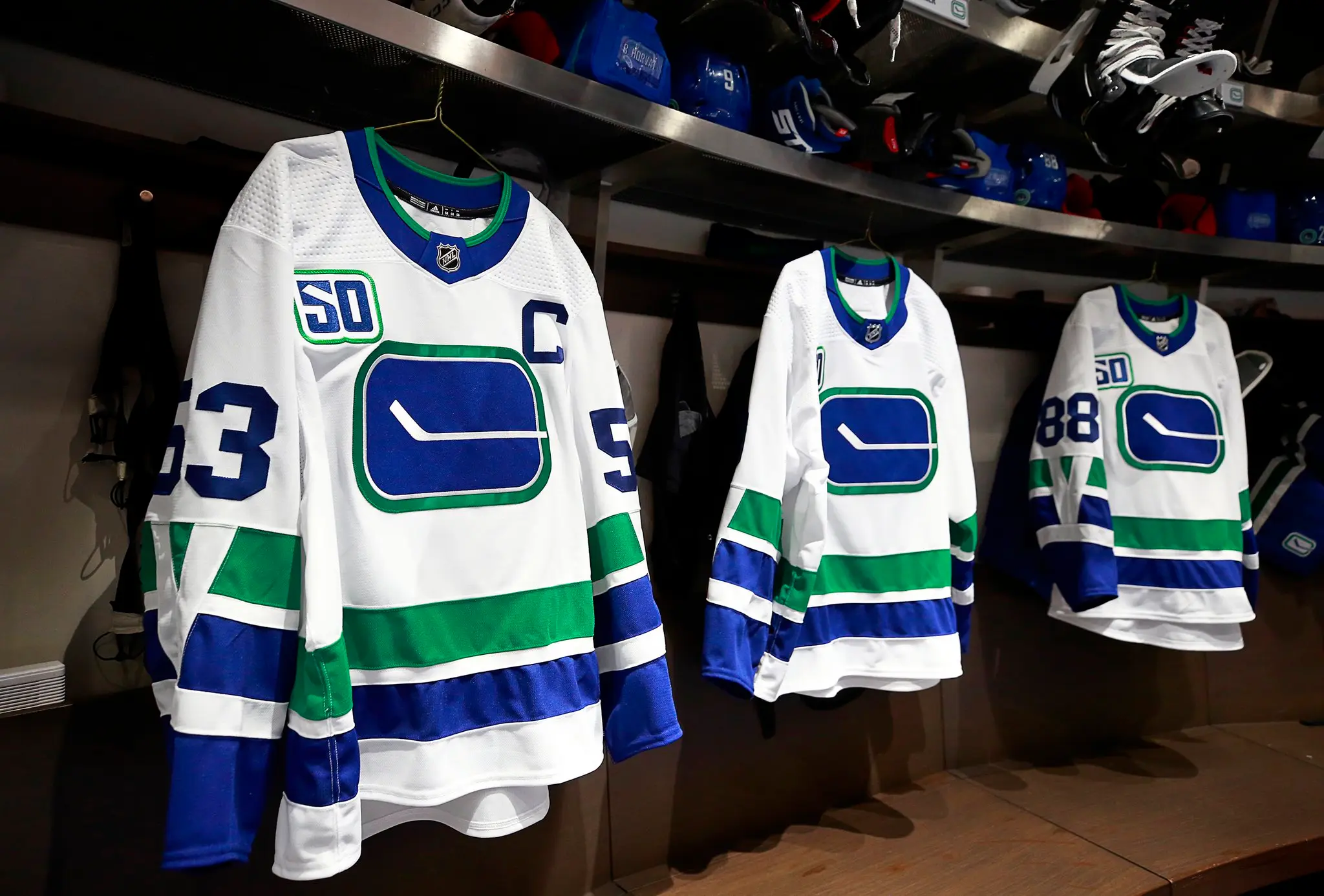
In the years and decades afterward, the Canucks introduced more than a dozen new jersey designs. The team currently wears four different uniforms, none of which feature the “stick in rink” logo as the crest (although it has been used on multiple alternate sweaters in the new millennium).
“Blue and green is the West Coast look, “stick in the rink” is hockey,” Borovich wrote. “What are you trying to do with the image of the team? The smart look of a consistent logo and jersey creates a tradition and history and gives team players pride when they put it on, e.g. Montreal, Toronto, Boston and Detroit.”
Here’s the full text of Borovich’s letter:
Dear Sir,
What are you selling – hockey or jerseys? Johnny Canuck didn’t help you last night against the expansion Las Vegas team when you blew a two-goal lead with 10 minutes left in the game. It didn’t help you against Boston, Toronto or Montreal either. What are you trying to establish here? All the different jerseys didn’t help when Bure was here or the Sedins. OK, they came close, but no cup. It’s only been 52 years, Mr. Aquilini.
Tradition and pride in uniforms are a bit of a stretch with your teams. I am prejudiced, as I designed the “stick in the rink” logo in 1970, along with the blue and green uniforms.
Blue and green is the West Coast look, “stick in the rink” is hockey. What are you trying to do with the image of the team? The smart look of a consistent logo and jersey creates a tradition and history and gives team players pride when they put it on, e.g. Montreal, Toronto, Boston and Detroit.
Arthur Griffiths could not stand the money he was losing with poor attendance, so he went to California to get a new look. Coach Harry Neal said when they played in New York on Halloween, they won best costume.
My logo is already established with the shoulder look and the history, but the players must feel they are in a fashion show and that is why they blow a two-goal lead with 10 minutes to go!
I guess the sweater business is doing OK for you – it’s Christmas.
I imagine the “stick in the rink” would look good beside the Stanley Cup.
Maybe our grandchildren will enjoy it, right Francesco?
Yours truly,
Joseph Borovich
West Vancouver
West Vancouver
The Canucks — wearing the Orca logo on their primary road sweater — will return to action on Saturday night when they visit the Vegas Golden Knights at 7:00 p.m. PT.

