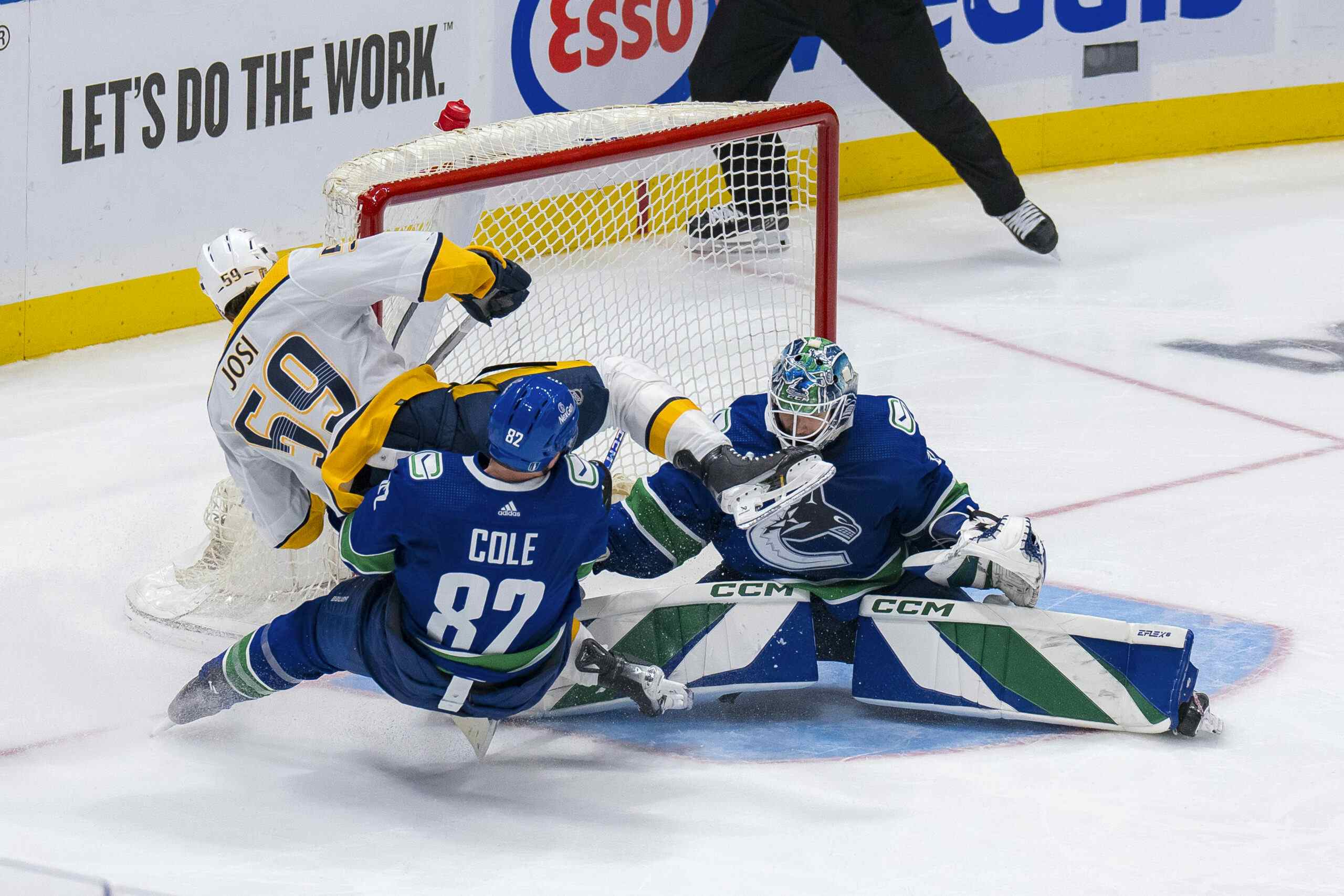
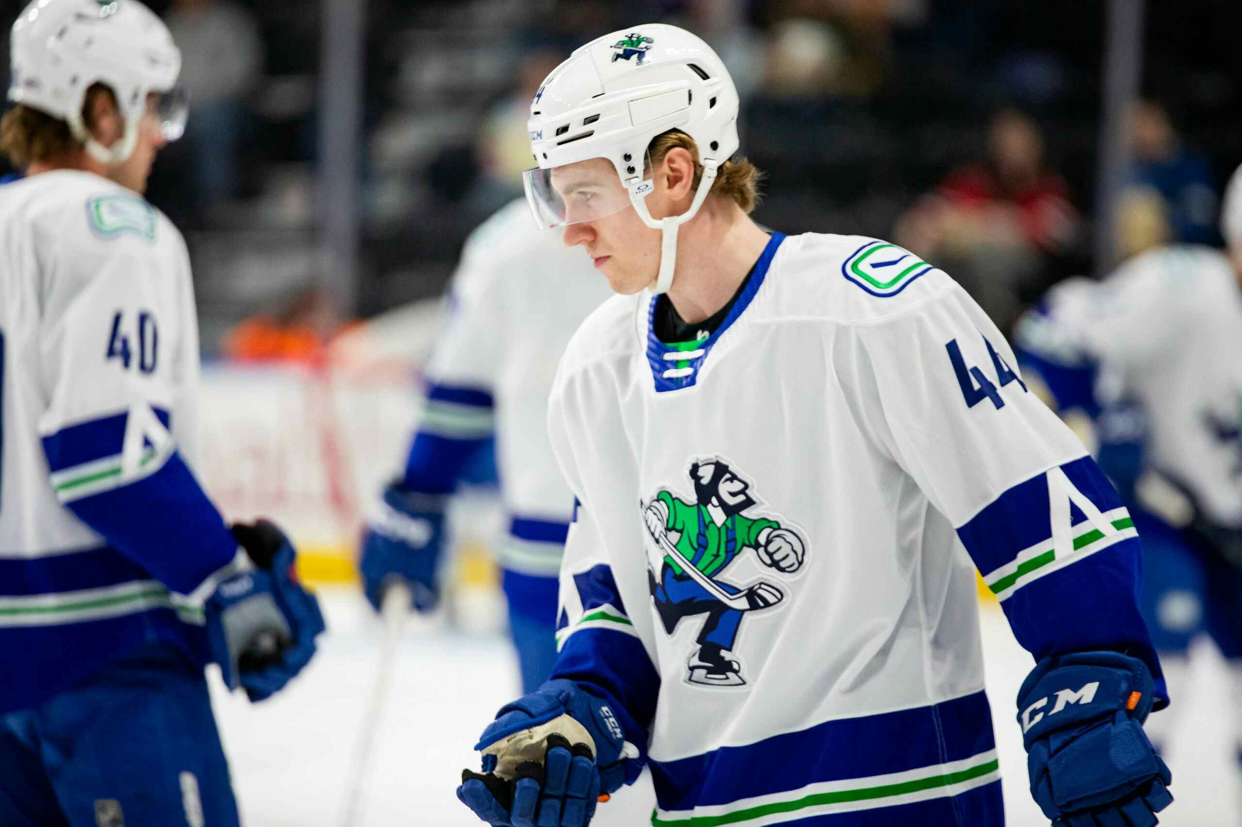
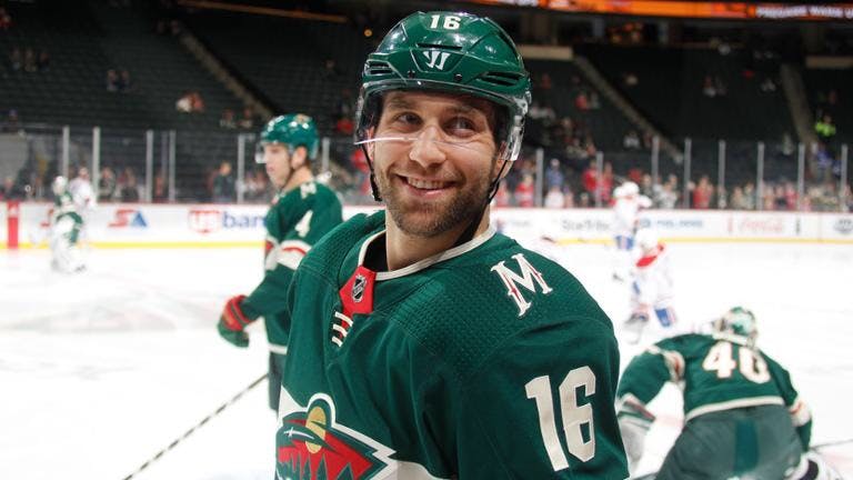
WWYDW: Jason Zucker
4 years ago
The draft is just a few weeks away, and with the event being held in Vancouver, the Canucks have found themselves at the centre of the types of rumours and speculation that are common at this time of year.
One rumour that appears to have legs is that the Canucks have interest in Minnesota Wild forward Jason Zucker.
Zucker is 27 and has 4 years left on a deal that pays him 5.5 million annually. He’s been a strong even-strength scorer for much of his career, and is coming off three straight 40+ point seasons, including a 64-point campaign in 2017-18.
Would you trade for Jason Zucker? What would you be willing to give up?
Last week I asked: What jersey design would you like to see for the Canucks?
Goon:
This redesign is exactly what I wanted. I liked everything about the old jerseys except the big stupid “VANCOUVER” on the front. The modification to the stick-in-rink on the shoulder is slick, too.
Snoho:
A cynic would say a team only changes their jerseys to boost sales. This change is pretty subtle so it’s nice to see it’s not a cash grab.
I prefer the skate but that’s a reflection of my age. If I wasn’t a kid in ’94 I’d probably find it ugly. The whale logo was never overly great or relevant. It’s time to change it up. A Johnny Canuck logo could work.
Killer Marmot:
I’d keep the fish just because I’m tired of all the major changes throughout the years. But the “splash” component where the orca breaches the water is confusing and incoherent. It could use a little tweaking.
j2daff:
the whale has no real relevance at this point and is dated at this point as well. Would like to see a redesigned logo and to be honest a more modern/flashier colour scheme as well. Just me although I’m not holding my breath that the majority will agree. At this point the flying skate would be my favorite we have had.
kanuckhotep:
Coleman E. Hall when he started the Canucks in 1945 chose Johnny Canuck likely to reflect the wood industry of B.C. That was the logo in the 1960s when they played at the old PNE forum and could never figure out why they abandoned it. Yes I’m giving my age away but for me Pac-Man smiling hockey rinks, spaghetti skates going down hill and an aquatic mammal never cut it with this fan. Get rid of Orca Bay. Those guys are history just like these jerseys and the next idiotic ones they come up with.
Forever1915:
The uniform can stay the same except have the orca restyled by an Indigenous artist who can incorporate authentic traditional design elements (e.g. ovoids).
Captain Video:
I would like to see the “Vancouver” placed under the orca in smaller font and to the right. Sort of like an appendectomy scar.