Welcome to a new series here at CanucksArmy, where over the month of August, we’ll ask a new question each day about the Vancouver Canucks. We’re calling it “31 days, 31 questions”. Today, on August 13, we’re trying to figure out what the Canucks Hometown Remix jersey will be. All 32 NHL teams will be partnering with Fanatics for a Hometown Remix jersey, and the guidelines for these uniforms appear to be much looser than Adidas’ Reverse Retro series was. Those designs were all redesigned and/or colour-swapped versions of old uniforms; these are likely going to be more experimental and unorthodox, like the NBA’s City Edition jerseys Nike produces each year.
We already have a glimpse of what to expect, thanks to the Florida Panthers’ jersey already finding its way onto eBay. And folks, it is bright pink.
Not to make this about the Panthers, but what a jersey. It’s bold, the gradient sunset behind the palm tree is phenomenal, and the only way it would scream Miami Beach more is if they put Pitbull on it. This is the kind of fun the Canucks should be gunning for, albeit in a more Vancouver-y way.
All we know about the Canucks’ Hometown Remix so far is the main colour, reported by YouTube jersey insider Icethetics to be navy blue (Specifically Pantone 296 C, for my fellow colour nerds out there). That gives us a basic sandbox to work in, knowing that we won’t be getting anything in the Canucks’ 80s or 90s colour range. But it also limits what we’re likely to see. How do you make the same colours the Canucks already use more fun? Let’s figure that out together. Johnny Canuck (again)
We’ve been down this road before.
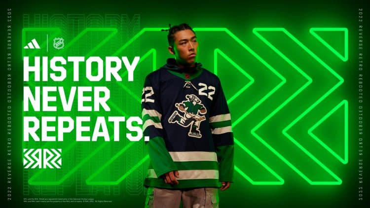
Vancouver’s last Reverse Retro with Adidas was a green and blue remix of the 1960s WHL Canucks’ uniforms with Johnny Canuck on the crest. And the jerseys their farm team in Abbotsford wears already feature a modern version of the character. So the odds of Johnny returning for this uniform are smaller, and frankly, that’s a relief.
 NHL.com
To be clear, there’s nothing wrong with this jersey; it’s actually quite nice! It’s just time for something new and more adventurous.
M-orca
When in doubt, just do another orca jersey.
The Canucks brought back the West Coast Express Era gradient orca for their first Reverse Retro in 2021, and the final product combining navy and green became affectionately known as the ‘Sprite Can jersey’. The one real direction the Canucks haven’t gone with the orca yet is to add green to the logo itself. Maybe we’ll get another 2000s uniform with a more colourful whale on the front. But that’s not exactly a new idea, either. What else you got?
Green and Blue Skate
NOW we’re getting somewhere.
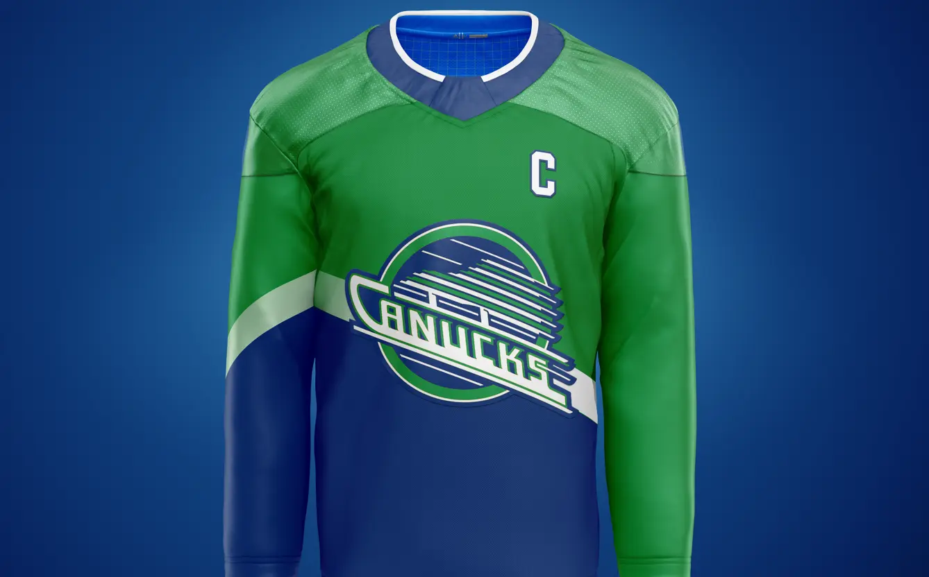
A green-and-blue flying skate has somehow never made it to the Canucks’ uniform rotation, and I think it’s about time. Some of the older crowd (i.e. millennials) might clutch their pearls at seeing their beloved childhood jersey in the modern team colours, but it’s the final frontier of Canucks remixes yet to be explored. You could do something simple, like a recoloured version of the original uniforms. OR, if they wanted to do something really bold, perhaps a new take on the infamous salmon skate jersey?
Here’s what a remix of that might look like (I made this in a few hours, so please be kind):
 Lachlan Irvine
Jersey concept by Lachlan Irvine
Here’s the type of experimental look I think the Canucks should be aiming to achieve. We’ve tilted the skate upwards so the “flying” moniker is more appropriate, and it takes an otherwise forgotten jersey and breathes some new life into it. It’s fun, and I have no doubt it would fly off the shelves. If you love it, you’ll be front of the line to grab one. If you hate it, it’ll be gone in a year anyway. Everybody wins in the long run.
But there’s an even more fun idea still left on the drawing board. And it’s easily the best one.
The Flying V
In 2020, Twitter user @S7Dsn posted this concept for the original Reverse Retro program, and I have never forgotten it.
This is EXACTLY what the Hometown Remix series is meant to be. It’s obviously a bold design, a refreshing change from anything the Canucks have worn recently, and extremely Vancouver. If you wanted to add even more local details to it, sublimation could be used to add discreet designs and patterns to the V, like mountains, trees, First Nations art or even a killer whale or two. Simply put, this jersey has so much potential as a base for something unforgettable that fans will talk about for generations. And probably with more fondness than the original Flying V, too.
What do you expect the Canucks’ Hometown Remix to look like? Let us know in the comments below.
Sponsored by bet365