
Nation Sites
The Nation Network
CanucksArmy has no direct affiliation to the Vancouver Canucks, Canucks Sports & Entertainment, NHL, or NHLPA
A linear trip back through all jersey schemes in Canucks history
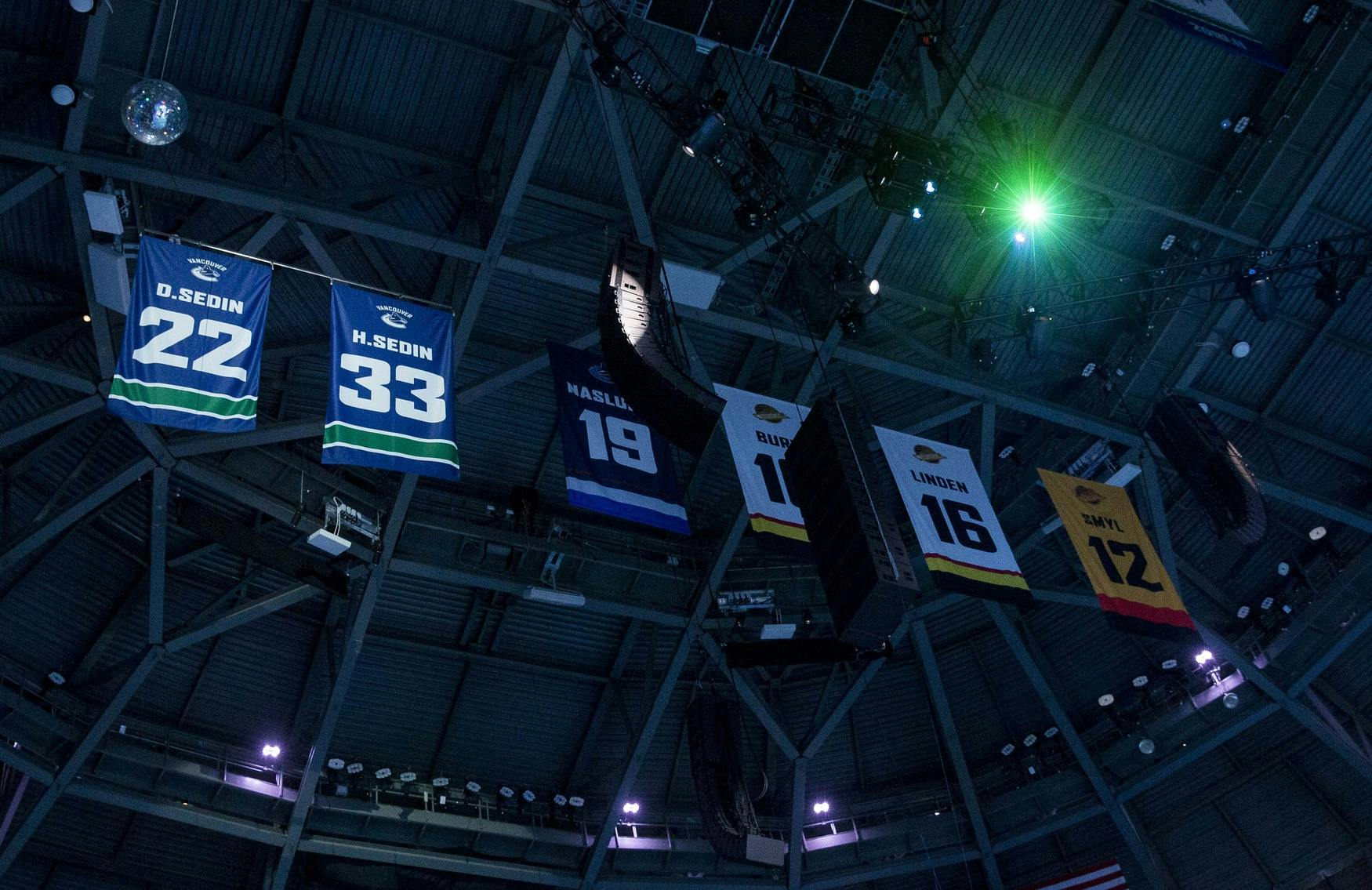
Photo credit: © Bob Frid-USA TODAY Sports

Apr 24, 2026, 09:00 EDTUpdated: Apr 23, 2026, 21:31 EDT
Vancouver Canucks history isn’t just told through wins, losses, and eras. It’s stitched into the fabric of each jersey that the players pull over their heads before every game.
The Original Six teams have had little to no alterations to their jerseys throughout their existence. The same can’t be said for the Canucks, who are among the franchises that have undergone the most visual transformations throughout their NHL existence.
Similar to how the Canucks have cycled through players over the years, they’ve also moved through a wide range of visual identities.
The Stick in the Rink (1970-1978)
Before the NHL arrived in 1970, Vancouver hockey had the infamous Johnny Canuck lumberjack, a rugged West Coast image on the crest of their jersey. When the Canucks joined the league, that identity evolved into something cleaner and more regionally grounded.
The inaugural blue, green, and white uniforms were anchored by the “stick-in-rink” logo, which reflected British Columbia’s natural landscape. Subtle design choices, like the hidden “C” within the crest, hinted at a deeper identity that wouldn’t be fully appreciated until decades later.
The Flying V (1978-1985)
In 1978, Vancouver took one of the boldest colour swings in NHL history. Out went blue, green, and white, in came black, red, gold, and the infamous “Flying V.”
The new design was far less subtle than the Canucks debut look. It was loud, unconventional, and divisive. But it coincided with the franchise’s first real stretch of relevance.
This was the look the Canucks had once they finally broke through. After limited early success, the Canucks rattled off six consecutive postseason berths, highlighted by the improbable 1982 run to the Stanley Cup Final against the New York Islanders.
The Skate (1985-1997)
As the 1980s progressed, the Canucks’ success dipped, prompting another identity shift.
With that, the Flying V receded and was replaced by the hugely popular “flying skate” logo. The colour palette slightly evolved from the original orange and gold into a deeper red and yellow, most associated with the 1994 team.
Led by Trevor Linden, Pavel Bure, and Kirk McLean, that group pushed Vancouver to within one win of the Stanley Cup against the New York Rangers. A key reason many fans believe the black skate still represents the franchise at its emotional peak.
For a brief stretch, the Canucks experimented with the “salmon skate,” a black-and-red gradient jersey introduced through the NHL’s first third-jersey program. Notably, the skate jersey became iconic not just because of its design, but because of its proximity to success.
The Orca (1997-2007)
During the mid-1990s, a shift in ownership from the Griffiths to a group led by John McCaw Jr. triggered a full organizational reset: out went the skate, in came the Orca.
Under the new branding, the team adopted a darker navy, burgundy, and silver colour scheme — a clear departure from the high-contrast, energetic visuals of the previous decade. The logo itself tied directly to Orca Bay Sports and Entertainment.
Although results on the ice fluctuated, this period laid the foundation for the next core that would eventually redefine the franchise.
When the NHL launched its Reverse Retro program in 2021, Vancouver revisited its early-2000s gradient look, reworking it in blue and green — a divisive nod blending nostalgia with a modern palette.
In 2022, the Canucks leaned further into their roots, unveiling a navy-blue Reverse Retro jersey inspired by Johnny Canuck first worn in 1962. The look swapped the classic red stripes for green, tying the franchise’s earliest identity back into its current colour scheme.
The Blue and Green Orca (2007-present)
Keeping one foot in the past, the Canucks reset again in 2007 with Reebok’s Edge redesign. The Orca remained front and centre, but the colours returned to blue and green with Vancouver rainbowing over the Orca, creating a look more aligned with the team’s Pacific Northwest identity.
Results followed. Backstopped by Roberto Luongo and driven by the Sedins, the Canucks reached the 2011 Stanley Cup Final. Generationally, this became the defining Canucks look.
The Canucks shifted away from “Vancouver” on top of the logo but stuck with the modern Orca look. This is the current design they
Returning fan favourite alternate jerseys
History eventually circled back.
Celebrating their 40th season in 2010–11, the Canucks reintroduced their original white stick-in-rink jerseys during a Presidents’ Trophy-winning campaign, notably featuring no nameplates on players’ backs.
Embracing their past once more, the Canucks honoured the 1915 Vancouver Millionaires at the 2014 Heritage Classic before reintroducing the black skate in 2019–20.
Fan response was immediate. When given the choice, nearly 70% of fans voted to bring the skate back. And by 2023, the team had modernized it with sharper lines and bolder contrast for its 50th-anniversary season.
The Canucks have worn more than 30 variations across five major eras. Each jersey reflects a version of the franchise: expansion era optimism, experimental risk-taking, corporate reset, and stability as a contender.
And if history suggests anything, it’s that the next great Canucks era won’t just be remembered by who leads it. It’ll be remembered by the jerseys they wear.
Watch our full YouTube video on the history of Canucks jerseys here:
Sponsored by bet365
Breaking News
- Could Elias Pettersson spend time back on the wing for the Canucks in 2026-27?
- JPat’s Monday Mailbag: What’s the best path for Braeden Cootes’ development in Canucks rebuild?
- Recent staffing decisions leave Canucks with big holes that must be filled in player development
- Canucks prospect Adam Novotný talks about his development journey and who he models his game after
- Who will make up the Canucks’ leadership group in 2026-27?

Vancouver CanucksTeam Cap Summary

Cap Summary
2026-27
2027-28
Projected Cap Hit
$86,185,833
$62,923,333
Projected Cap Space
$17,814,167
$50,576,666
Current Cap Space
$17,814,167
$50,576,666
Active Players
23/23
13/23
Draft Picks
Round
'26
'27
1
2
1
2
2
2
3
1
1