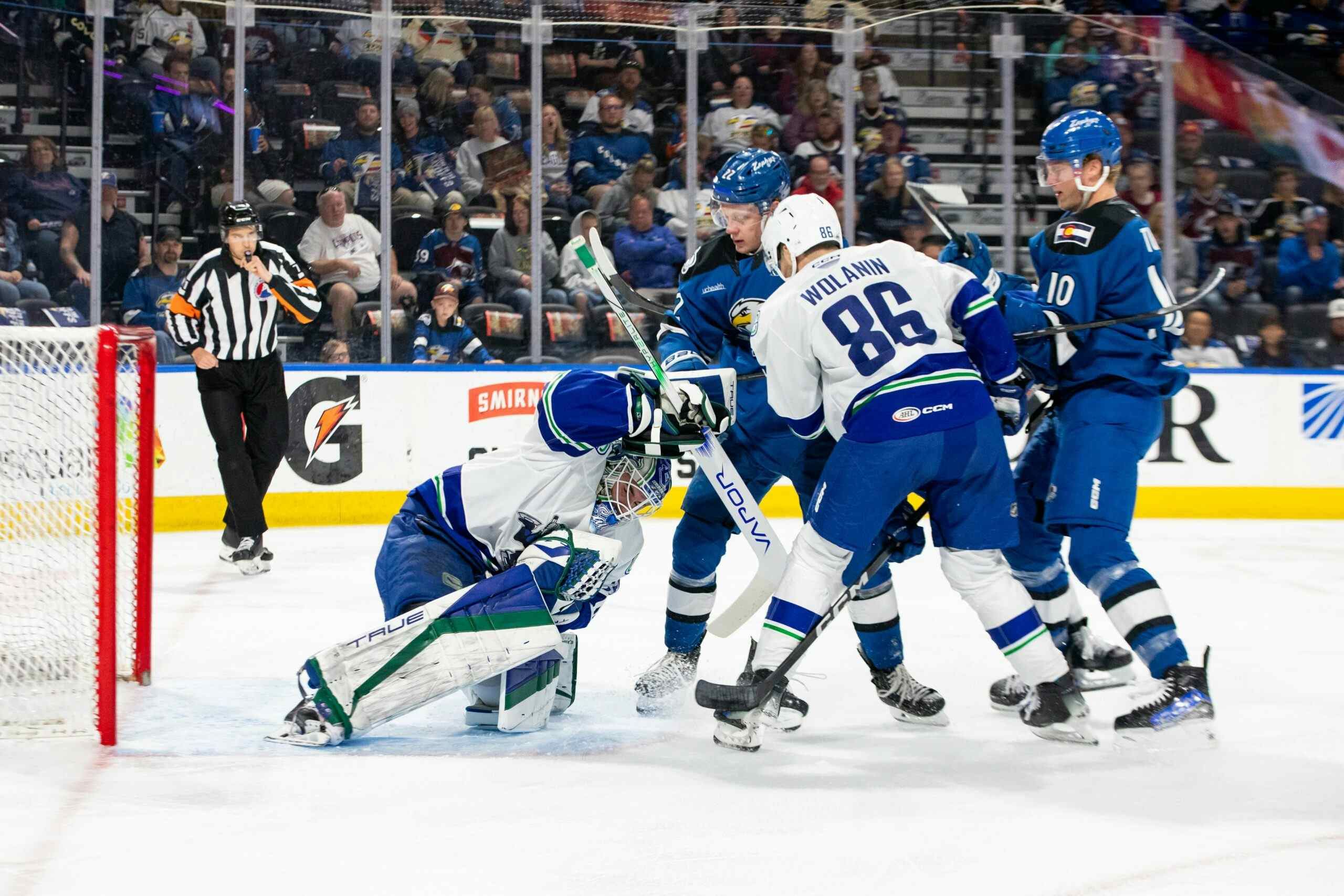
The End of Reebok and the Adidas Takeover
Photo Credit: Kevin Sousa – USA Today Sports
The NHL is now in their 100th year, and to mark the occasion, they’re going out with the old and in with the new. Since the 2007-08 season, Reebok has been the uniform provider of the NHL, but that will all change a decade later, as Adidas will be taking over for the 2017-18 campaign.
The last time this league-wide change took place, a lot of teams took the opportunity to rebrand themselves and try some new things.
Some worked nicely. Others worked not so nicely. (Please, no more apron lines)
Regardless, the Canucks set was probably one of the most talked-about.

Not only did the Canucks ditch the Navy-Black-Red-Silver combo that they had worn for a few years, but they also returned to their roots and brought back the ocean blue and forest green that fans had long wanted. The Canucks made money off it a few years prior, introducing their vintage uniform as an alternate.

However, it wasn’t all well received as they also introduced the Vancouver arch above the orca on the uniform. It was a bold decision, which paid homage to the pre-NHL Canucks who wore the Canucks arch above the number on the front of the jersey.

Some wondered if the Canucks should wear the “Canucks” arch at home and “Vancouver” arch on the road, but they stuck with Vancouver throughout, and after initial cold feet, the fans really warmed up to them.
It’s amazing what success in a uniform can do for their optics.
During this era, the Canucks have worn four other uniforms as well. The Millionaires uniforms (worn for special events, among them the Heritage Classic) are very popular among fans.

They also sported an ode to their inaugural season in the 2010-11 campaign, wearing the original white uniforms. So true to form, they didn’t even include nameplates which needed permission from the league.

Last season, after tireless pleas from the fans, the Canucks brought back the 94-era uniforms during the 20th Anniversary of Rogers Arena/GM Place.

Starting in the 2008-09 season, the Canucks introduced their authentic third jersey, the modernized stick-in-the-rink, and it has been popular among fans, but it’s too similar to their regular uniforms… this leads us into the central portion of this post.
The Adidas Age
As mentioned before, next season the NHL will be entering the Adidas era. The league isn’t expected to overhaul their sets this time around completely, but tweaks and changes are sure to be expected. The Oilers are planning on turning their orange’s into their home uniforms, and the Devils will be going full rebrand.
Also, the NHL is ditching alternate uniforms, at least for next year, which is no surprise as they did the same in 2007-08 so that they could focus on the primary uniforms.
Now that the table has been set, here’s what I think the Canucks uniforms will look like next season.

I know what you’re thinking. No, nothing has changed much with the Adidas takeover. Just a simple collar update, and that’s about it. Personally, I don’t see them changing it this time around.
There are some changes that I would make though:

The changes are simple but effective. You make the Johnny Canuck logo — beloved and longed for by many fans — the shoulder patch, and then you promote the alternate logo to the primary, and finally retire the Orca Bay logo to its rightful place in the rafters, as it hasn’t been relevant to the team for years.
Recent articles from Matthew Henderson
