Canucks Ink

12 years ago
I’m not a tattoo guy myself, but I have a certain respect for fans with enough passion for their team that they’ll get a logo, or a favorite player’s number, or some variation thereof etched permanently onto their skin. At the very least, anyone willing to spend the money and risk having their tattoo turn into wrinkly gibberish as they age, earns the right to forever get a pass from accusations of being a bandwagon fan. In fact, I think that’s kind of the point.
The power of tattoos is in large part derived from the image’s permenance. It’s this permenance that is suggestive of commitment and immutability. Tattoo’s serve as honorifics for loved ones (both living and deceased), family members, friends, even one’s country. They’re a visible symbol of group identity, and for some sports fans, that group is the team they love and root for.
What fascinates me about Canucks tattoos in particular, is that those who get them need to come up with a permenant image of undying support, for a franchise that has changed their team colours and logo four times, their jerseys five times and have yet to achieve hockey immortality (which, only comes when the team lifts hockey’s ultimate prize). How do you come up with an immutable "Canucks image" when the idea of a stable Canucks image is an oxymoron?
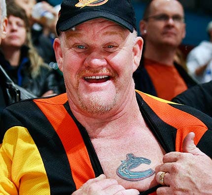
Take the guy in the image above. He’s got a hat with the skate-logo, he’s wearing the ghastly flying V jersey from the early 80s, and he’s got the Orca Bay Whale tattooed on his chest. It’s kind of perfect, and certainly representative of the constant tension surrounding Canucks team imagery. I’m not meaning to be judgemental, in fact the push and pull between celebrating a short (and often sordid or disappointing) history, and the fresh promise of reinventiion, is a Vancouver phenomenon, as much as it’s a Canucks fan-culture habit.
In many of the images below, that tension is curiously present and I find it fascinating. Lets take a quick look at how people have dealt with the impermenance of Canucks team imagery when coming up with a permenant image of support to etch onto their body…
The Thorough Curation
One way of getting around the constant team image schisms, is to take a completist approach. This tattoo, from an old CDC thread about team ink does just that:
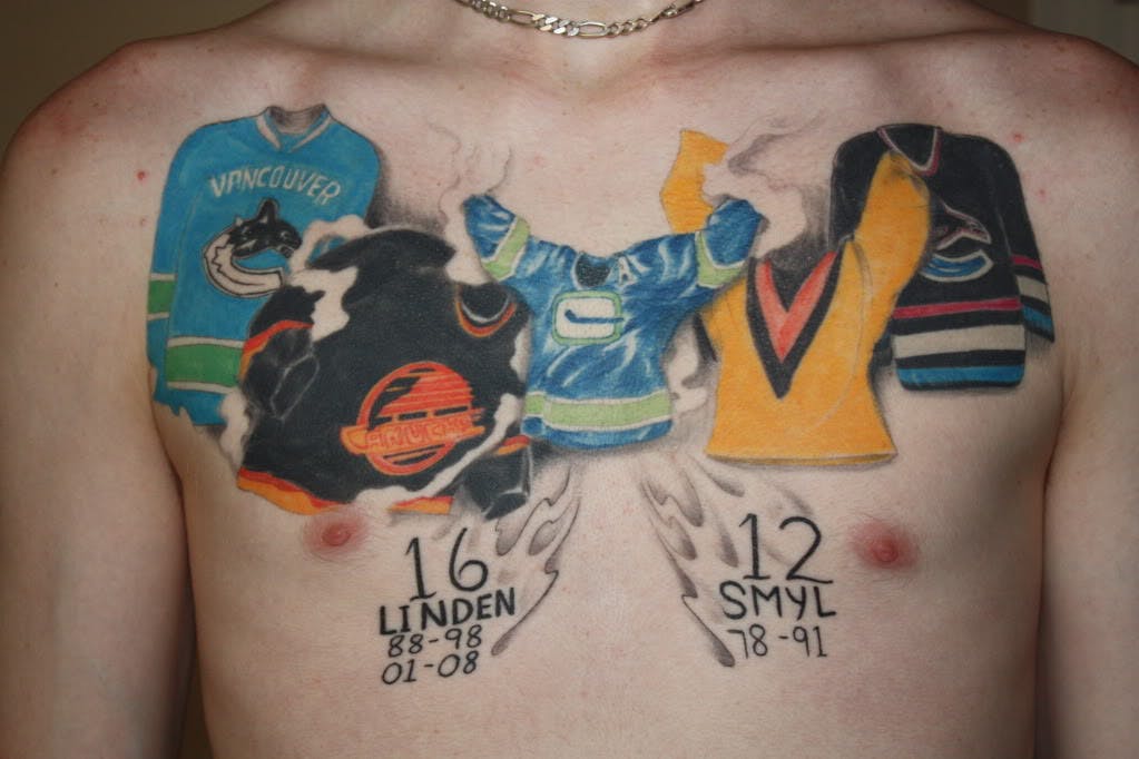
That’s all five jerseys, and all four logos, plus the numbers and term of two of the Canucks retired numbers. I wonder if the guy has since added Markus Naslund, and also, if forty years from now, he’ll have gone right around his arms and to his back with the new sweaters the Canucks inevitably add (at a rate of one every eight or so seasons).
Bonus points for the ghostly fire and the smoke that rises up from the disembodied sweaters. I like to think the smoke is meant to represent our fanbases collective rioting habit.
The Hybrid
This tattoo (also found through google searching, it belongs to a fellow who is a giant Canucks fan in Texas) is actually a pretty creative attempt to come up with a lasting Canucks image amidst the constant upheavels in franchise imagery.
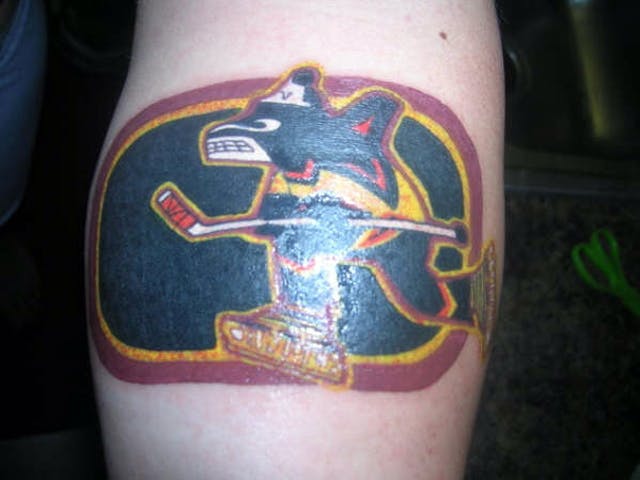
The outline, and the hockey stick are, of course, the original Canucks "rink and stick" C, the Orca Bay Whale is shown in mascot form, wearing the 80s flying V jersey and skating on the late-80s, early-90s Canucks skates. While the result is inarguably busy, it’s actually a pretty awesome way to unify the disparate forms the Canucks logo has adopted over the years.
A Canucks Tattoo that is Subtly About Something Else
In this case, we’ve got a guy with an attractive (but attainably nerdy) woman wearing, supposedly, nothing but a Canucks jersey, glasses and high-heels while suggestively holding a hockey stick between her legs.
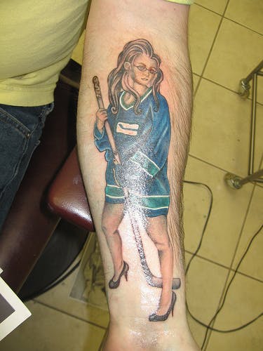
While the tattoo doesn’t account for the team’s three other logos and four other jerseys, it doesn’t have to! The tattoo is either a comemoration of a wicked one-night stand, or a tribute to a girlfriend or partner, or maybe just an expression of his own particular female ideal. Regardless, the "Canucks branded tattoo that is subtly about something else" is a clever way of working around the "always changing" team iconography issue.
The Conservative Approach
By going small, and selecting a relatively discreet tattoo location, you’re playing it safe.

What’s the worst case scenario here? By the time it’s 2025 and the Canucks are onto their ninth team logo and tenth rendition of the team sweater, at least no one will see the tattoo unless you’re going swimming, wearing a preposterous Award Show dress for the hell of it or about to get naked. The first scenario is seasonal, the second is rare and the third is basically irrelevant. If you’ve gotten that far, a stupid, small tatoo of a now unused Canucks logo is unlikely to be a deal-breaker. This is the smart, risk free play.
Let Your Freak Flag Fly
I had to include this, but to be totally honest I have nothing to say about it really.

Keep it classy folks.
The Logo Free Approach
Here’s a tattoo from @AlexLovesBurrs that is logo free, and pays respect to some recent Canucks who are sadly no longer with us (Rypien and Bourdon):
Now I remember this tattoo causing something of a stir when it appeared on twitter this summer. Many were confused by the presence of Burrows’ number with the numbers worn by Rypien and Bourdon. I think looking at all three together is not the tattoo wearer’s intention, I think it’s her favorite player’s number, combined with the numbers of two young Canucks skater who the world lost too early, and who she wishes to honour.
All of that aside, I think the logo-free approach is a reasonable one. If you go logo free, then you know you won’t be left in the lurch when the Canucks change their logo to the Inukshuk in English Bay with twin Lions mounted on it roaring, and alter their team colours to maroon and white in honour of the Millionaires.
The Johnny Canuck
This comes to us via @schneidz, and it’s a pretty sweet tattoo:

Johnny Canuck had never been featured on an NHL Canucks jersey, until the character’s face started to be used as a shoulder patch on the team’s third jersey during the 2008-09 season. Johnny Canuck, was, however, used by the Vancouver Canucks when they were a WHL team in the 1960s.
Why this works to avoid some of the issues we’ve discussed here, is that it’s a timeless logo, that the team has kept around as part of its identity through the team’s very name (though Johnny Canuck image was basically lost, until it was reinvigorated by Luongo when he put the old comic book character on his mask in 2006). As a result a good old fashioned Johnny Canuck tattoo is a good way to bridge Canucks history without going for a hybrid or omitting logos entirely. Also, if you go with JC, you may be ahead of the curve for the next Canucks jersey change.
Recent articles from Thomas Drance