Canucks Army Roundtable: Fashion Week, Canucks Edition

7 years ago

Since their unveiling in August of 2007, the Canucks uniforms have been a controversial topic in the NHL. Some despise the arching “Vancouver” that covers the front of the jersey, while others love the fact they are embracing their city. Most agree, however, that after decades of identity crisis’ they finally have themselves back in the right colour scheme. Now, unfortunately, those hoping the Canucks would change their uniforms in a couple years time when Adidas takes over as the NHL’s uniform supplier, had a bucket of cold water dumped on them this week.
Trevor Linden co-hosted on TSN 1040 during President’s Week and said there are no plans to change the uniforms at all. Is it the right move? Our writers discuss.
Question: Do you think it’s the right move to finally have stability in uniforms (if you haven’t noticed, they’ve crammed a lot of looks into 46 years) or do you think it’s a missed opportunity to align a fresh new look with a young and up-and-coming team?
Always90Four
The Canucks have been the model of inconsistency when it comes to jerseys/color schemes and when they went to the VANCOUVER jersey set the kept the orca and let it live. It has now been the longest serving logo for the team and for that there is consistency.
However, with so many color changes made its tough to have a TRUE identity as a visual. The skate is my personal fav but i don’t think it makes sense to bring it back in the new color set regardless of the jersey change.
I say keep the orca and colors but potentially move the VANCOUVER wordmark off, maybe add laces or something, I dunno. Realistically, there won’t be a change as everyone thought with the NFL going to NIKE; some teams will revamp but I think for the Canucks sake, keep it the same and build off of what you have.
Third jerseys are a different story. I’d like to see the Canucks adopt a combination of their retros and current third and maybe yes maybe Johnny Canuck. Have your main third but wear each of the V, Skate, Millionaires, throwback 40th-anniversary uniform and heck the salmon! for one night a year. 82 games make that quite doable.
The fans are all split on what their favourite is and it’s the least intrusive way to keep their history relevant. That way, nothing is full-time in that regard and they get to maintain the orca blue and green look.
This issue is close to my heart as I believed going back to the skate was the answer but in actuality, that would just set the team back.
At least Benning can’t make THAT decision.
Jackson McDonald
I don’t like the orca all that much from a visual standpoint, if we’re being honest. I still much prefer the stick and rink, the skate, or even the Flying V (although I’ll admit that’s an objectively bad logo. I just like it for whatever reason.)
My opinion is irrelevant, though. These jerseys have been with the Canucks for a long time. They’re associated with the best Canucks team in history, and there’s a nice First Nations motif going on in there, too. It’s a fine jersey. The team could use a sense of consistency and the last thing they need to do is change their jersey AGAIN.
Just pick something and stick with it. I don’t even care what it is anymore… Unless it’s the Millionaires jersey. Those things are cursed.
Vanessa Jang
I don’t mind the orca because that’s the logo that I grew up with. I like the skate and it is obviously very historical, but I’m not sure how it would look as a permanent logo in this era.
Given the fact that Linden is so adamant on keeping the orca, it’s safe to say that Vancouver is NOT getting a new logo (much to the chagrin of lots of people). That being said, they shouldn’t leave out the option of changing the style. I think a lot of people can vouch for the idea of removing the VANCOUVER. Keep the colours because the blue and green are a great combo. Everyone should Google “Canucks jersey concept” and take a look at those.
The 3rd jerseys definitely need to be revamped. They’re too similar to the primary jerseys. Make it snazzy!! Incorporate some history and change up the style. In my opinion, Johnny Canuck should be the centre logo with the stick in the rink on the shoulders. They released a similar jersey in the team store, so I think they should build upon that idea.
Dylan Kirkby
I’d like to see the Canucks use their current alternate, with the stick in rink on the front, as their primary. I love the classic simplicity of it, and I’d much prefer a recognizable, consistent logo that can become an icon over time, rather than changing the logo with each successive generation of players on the team.
For their alternate, I’d love to see the millionaires Jersey. They’re sexy as hell and only getting to see them a couple times a year is criminal.
Taylor Perry
I’m with Dylan in that the Canucks’ current alternate – introduced in 2008-09 – is my all-time favourite design. The colour scheme and the simplicity of the crooked stick with the Johnny Canuck shoulder patches is fantastic. However, the Canucks organization is faced with an inherent problem when designing a logo – their team moniker cannot be readily linked to an easily marketable image, Johnny Canuck notwithstanding. Kerry Banks (in The Riddle of the Russian Rocket) once wrote how Orca Bay Sports and Entertainment – when it owned the team – considered renaming it the “Orcas” just to solve this issue. A “Canuck” is not a stick, a skate, or a killer whale. In fact, it is just a generic slang term for a Canadian – and it would be difficult to visually capture this in any logo. Somehow, the New York Yankees managed to do this by placing Uncle Sam’s cap on a bat against a baseball background, but that probably had more to do with that franchise’s continued success and rich history. The Canucks should probably do something similar – keep the current logo and colour scheme (perhaps even the alternate) and then have some sustained success with that logo so that it becomes readily identifiable as “Canuck.”
Tyler Horsfall
I’m up for a jersey/logo change. I don’t think the current logo or jerseys will last more than another five to ten years before being outdated.
I personally love some of the Johnny Canuck logo and jersey mocks. I think they could find a way to stick with the blue and green colour scheme to maintain some consistency. And, like Dylan said, the Millionaires kits are too nice to only be seen a handful of times.
Graphic Comments

Matthew Henderson
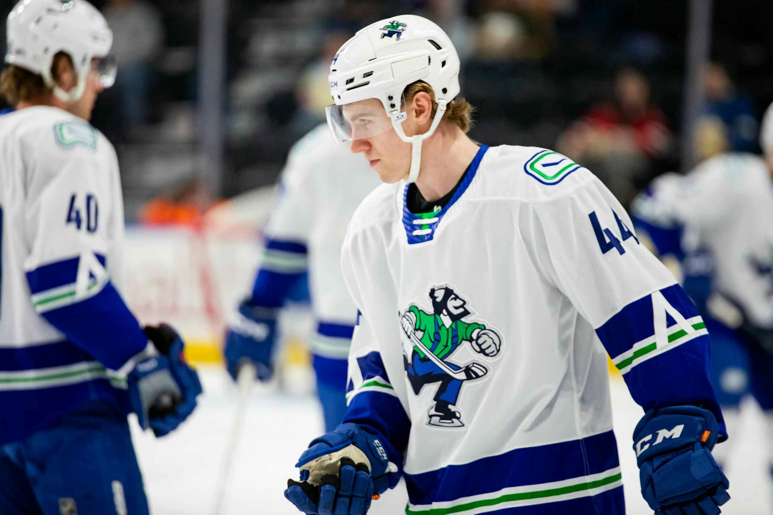
For me, I would change them. But not a tonne. I would take the stick in rink from the alternate and replace the current “Arched Vancouver Orca” that is currently on their primary uniforms. That logo is loved in Vancouver, and if a new alternate is introduced they would likely have to move away from that logo. I would then build a 3rd jersey based off the one from Utica, which uses green as the main colour for their uniform, something Canucks fans have craved for years and the uniform has been well received.

(These templates are from Icethetics, and are based off of the current Edge system, so that would change with Adidas, however, the idea is there)
The Johnny Canuck shoulder patch moves to the primary, which basically makes the primaries look like the current 3rds. A white version is born, and the full skating Johnny Canuck becomes the star on the 3rd jersey. It would be a great opportunity to create buzz around the city while the team rebuilds.
Recent articles from Matthew Henderson